
TASTE THE CULTURE
PROJECT // 002
A complete visual language for a Daytime Emmy-winning series — from the logo and opening sequence to the graphics that carried every episode.
VISUAL_LANGUAGE.SYS
BUILT FROM
THE LOGO OUT.
Design the mark.
Then build the world around it.
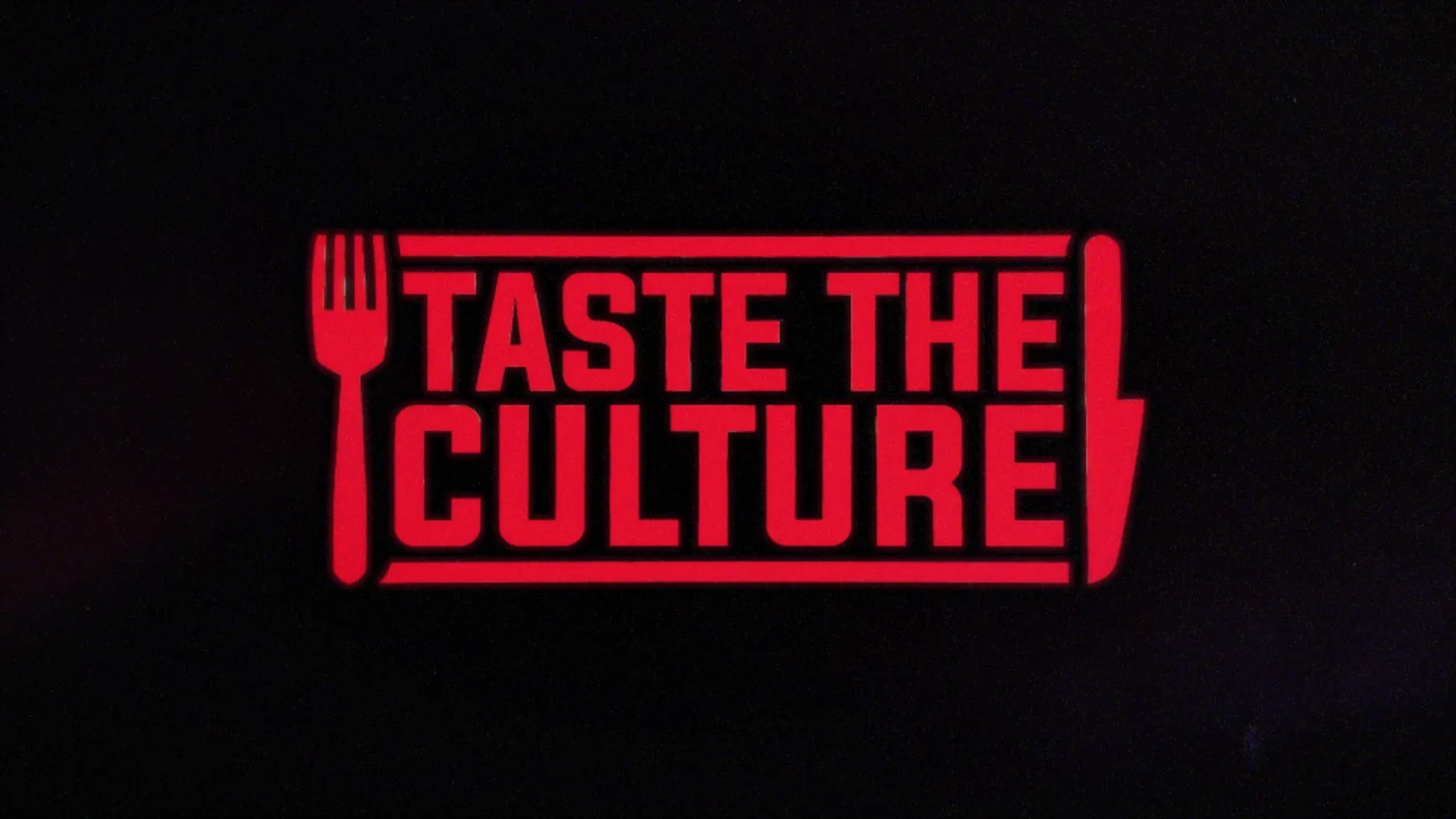
The graphics package began before there was a finished show logo. Seth developed the mark as part of the opening-title process, then used it as the foundation for the series’ motion language: collage, rough-edged typography, bold color and a broadcast system built to feel energetic without losing clarity.
MAIN_SEQUENCE.V04
THE SHOW
IN 17 SECONDS.
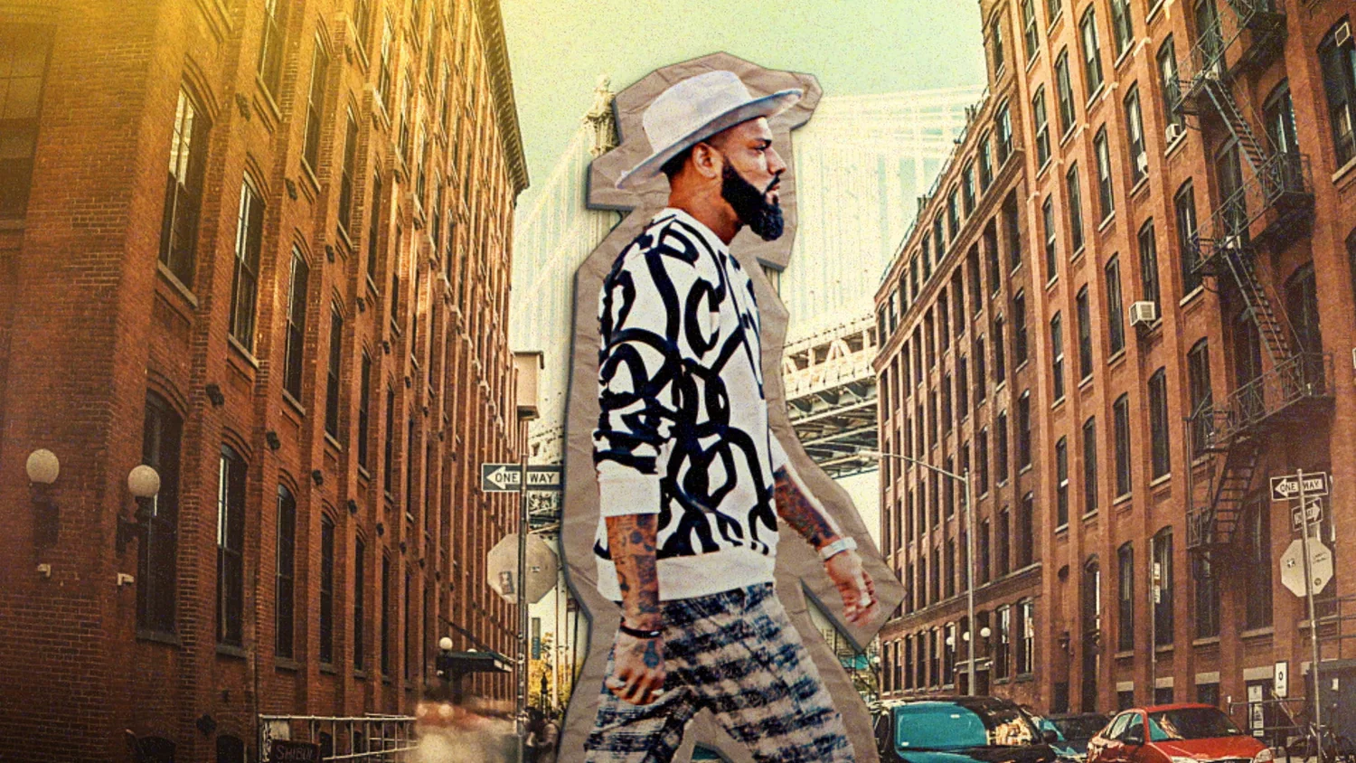
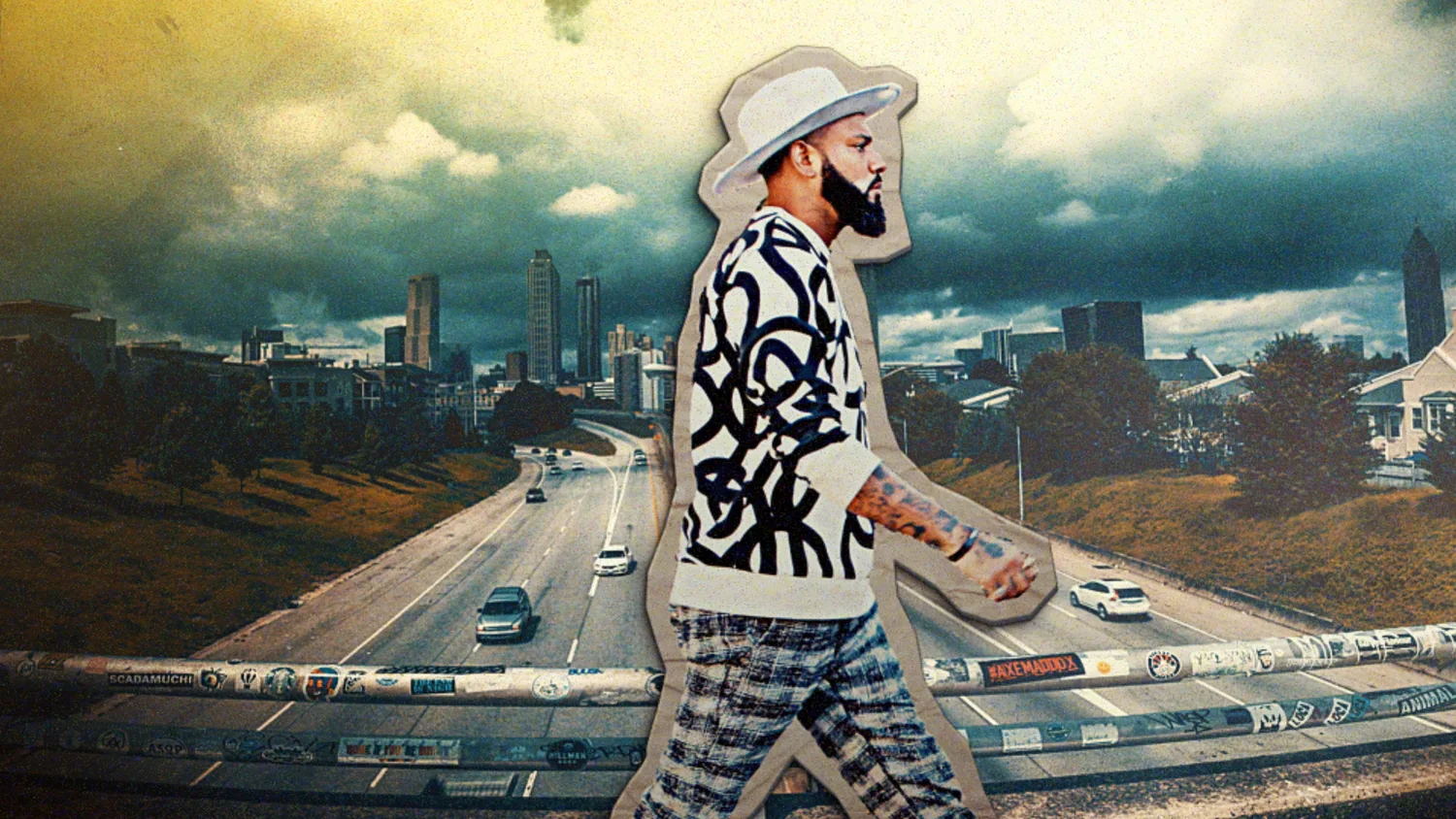
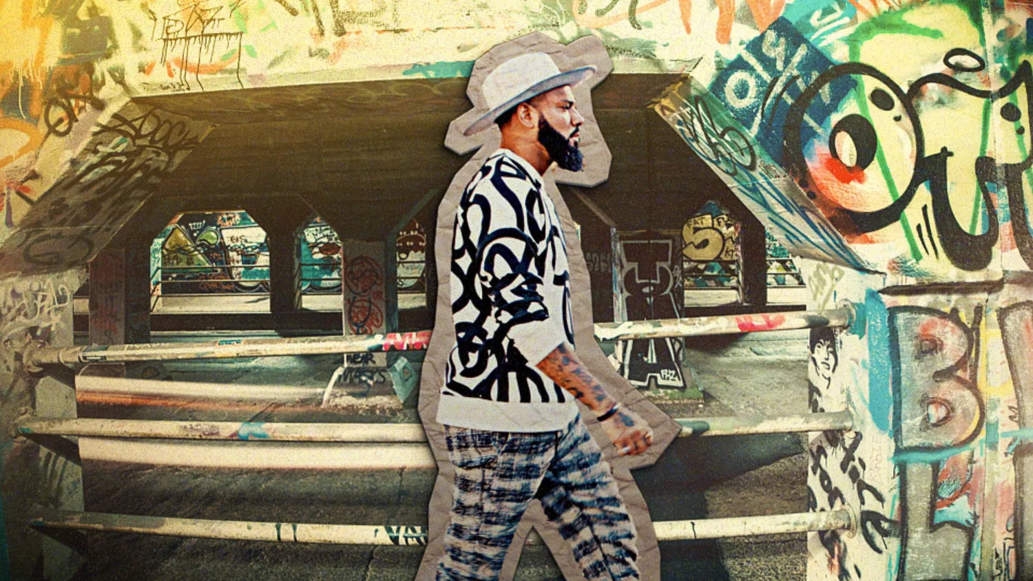
RECURRING_GRAPHICS.DAT
A SYSTEM BUILT
TO LIVE IN THE SHOW.
DESIGN → REPEATABILITY
Distinct enough to own the frame. Flexible enough to keep working.
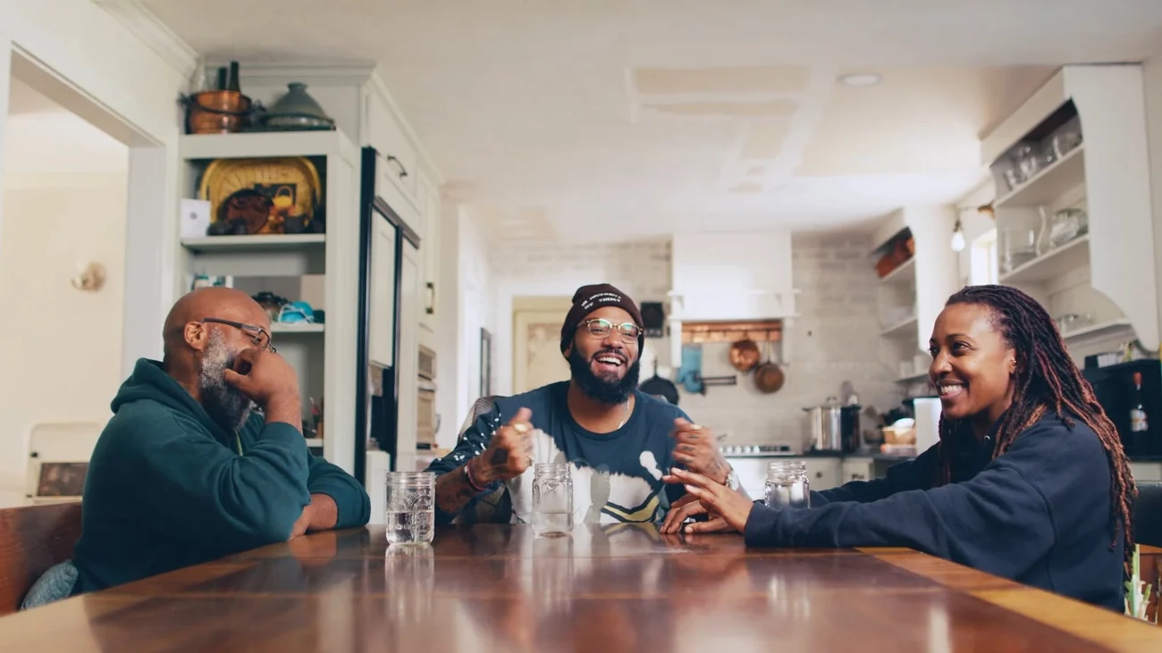
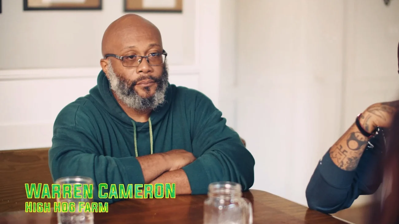
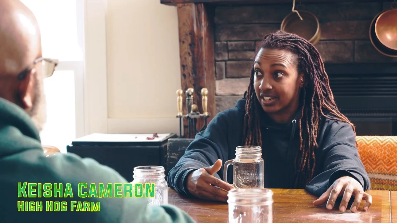
Lower thirds, explainers and recurring graphics were all designed as parts of the same package—not isolated overlays. The goal was a recognizable language that could sit over documentary footage, introduce people and ideas quickly, and still feel unmistakably like Taste the Culture.
PRODUCTION_ACCESS.LOG
BUILT FOR
A REAL SERIES.
DIRECTORROLE // VISUAL PACKAGE
DISCOVERYDISTRIBUTION // MORE
SEASONSSERIES SYSTEM // RECURRING
EMMY2023 // OUTSTANDING CULINARY HOST
IDENTITY_OUTSIDE_FRAME.SYS
THE IDENTITY
LEFT THE SCREEN.
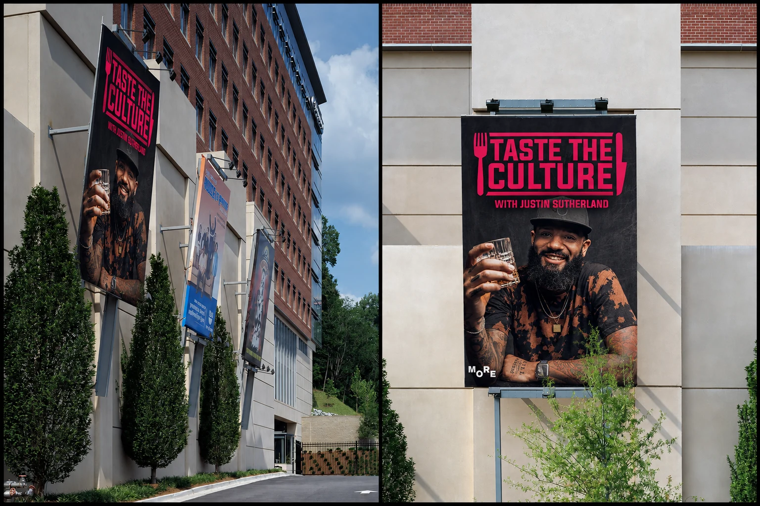
A logo built for more than the opening frame.
The mark created for the show became the public-facing identity of the series, carrying from the title sequence into promotional artwork and large-format campaign placements. The visual system wasn’t simply decorating the program—it was helping define how the program was recognized.
IDENTITY → DELIVERY
A VISUAL LANGUAGE
BUILT TO OWN THE SHOW.
Logo design, opening titles, lower thirds, graphical explainers and finishing all came from the same creative system. The result was a cohesive broadcast identity that could move between documentary footage, animation and campaign material while keeping one unmistakable voice.
VISUAL SYSTEM // DEPLOYED // END BROADCAST_